

B’s Blooms
An end-to-end application that allows users to customize bouquets from a local florist and place orders for delivery, ensuring they never miss out on high-quality arrangements.
Role
UI/UX Design, User Research, Interaction Design, Paper & Digital Wireframing, Low- and High-Fidelity Prototyping, Usability Testing, Design Iteration.
Problem
Busy individuals often struggle to find the time to pick up bouquets or deliver flowers to others. Additionally, the availability of high-quality bouquets is limited, as many are sold out or of poor quality by the time people can stop to buy them.
Product Goal + Target Audience
The goal is to design an app for B's Blooms that enables users to easily customize and order high-quality bouquets for themselves or others, with convenient doorstep delivery. The target audience includes busy individuals aged 18-60 who value convenience and quality.
User Research
I conducted interviews and created empathy maps to better understand the users and their needs. Through this research, I identified a primary user group: working adults who enjoy receiving or giving flowers but struggle to find the time to visit a store. They also prioritize receiving fresh, high-quality flowers.
Major Pain Points
Time: Busy working adults lack the time to visit a store for flowers.
Quality: By the time they can get to a florist, the bouquets are often of low quality.
Price: Users are forced to buy lower-quality bouquets at higher prices.
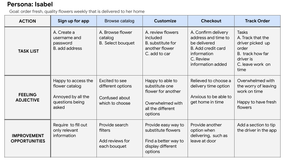
User Journey
Design
Connecting ideas with design solutions
Based on my research, I began sketching and iterating ideas on my iPad. This allowed me to explore various features and select the best elements from each draft, which then informed the creation of the low-fidelity wireframe.
These are the low-fidelity sketches of the home screen. The stars signify the features that I liked for the final sketch.
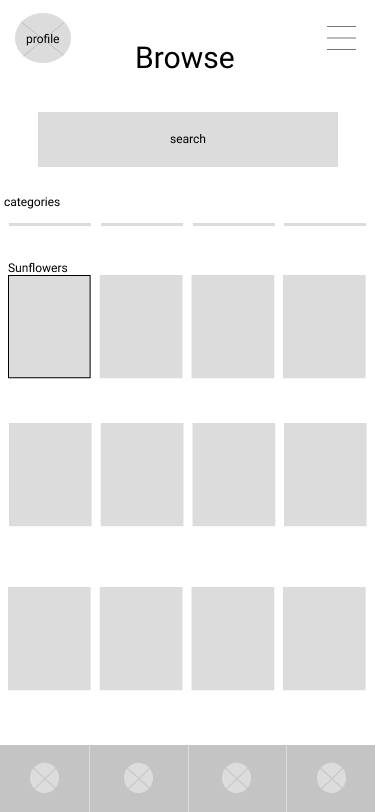
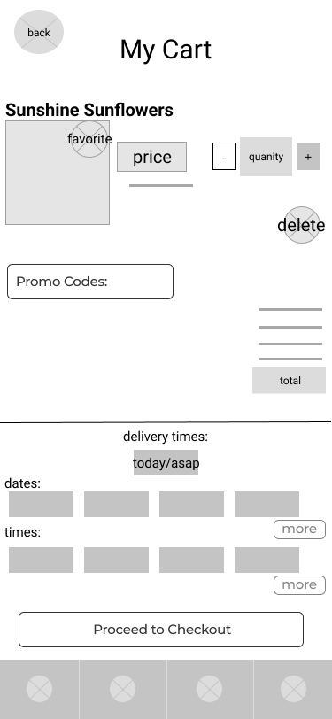
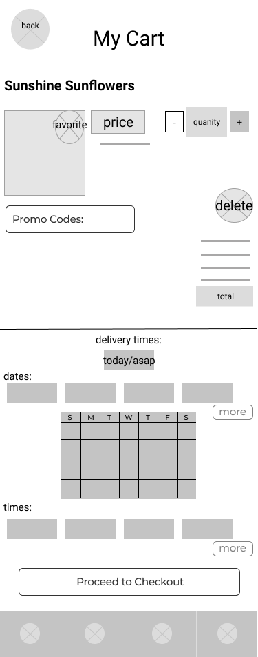
Low Fidelity Digital Wireframes
I created the low-fidelity digital wireframes using Figma, ensuring that the screen designs were informed by the insights from user research. After completing the wireframes, I developed a low-fidelity prototype, focusing primarily on the user flow for ordering a bouquet. This prototype was then used in a usability study to gather feedback and refine the design.


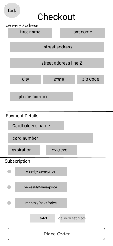
High Fidelity Mockup
Using Figma, I transformed the low-fidelity wireframes into high-fidelity mockups, refining the design with visual details, typography, and color to bring the user interface to life.

Color Palette
The design aimed for a simple, clean, and gender-neutral aesthetic. Shades of green were chosen for their natural associations, appearing throughout multiple screens to evoke a sense of freshness and vitality. Black was also incorporated to complement the green, adding contrast and reinforcing a modern, minimalist feel.

Logo
The logo was designed using the brand’s core colors from the app: a dark green for "B's Blooms" and a slightly lighter green for the bee. The typography is clean and easy to read, while the bee, attached to the "s" in "Blooms," symbolizes movement and growth as it flies away from the company name.
Typography
For the primary typography, I selected Nunito, a versatile font with multiple weights and sizes, used consistently throughout the app. Nunito was chosen for its readability and balanced, modern appearance. For headings, I opted for SF Pro Display in regular weight, chosen for its clean, legible style that complements the overall design while ensuring readability across devices.
High Fidelity Prototype
Takeaway
This case study taught me the importance of empathy and user-centered design. I learned that the design process involves multiple iterations, each crucial for refining the product and aligning it with user needs. Through continuous user research and feedback, I was able to ensure the app was intuitive and effective. Additionally, I gained a deeper understanding of visual hierarchy and how essential it is for guiding users seamlessly through an app. This project also reinforced the power of thoughtful layout and design elements in creating an impactful user experience.